Imaging applications usually have a considerable need to display images and other associated graphics. nGI fills this need by providing a complete framework for graphical drawing into windows, as well as placing hierarchical, interactive widgets on top.

At the center of this framework is the display class, which provides a connection to the native window of the operating system. This class handles basic window related functionality, such as creation and destruction, resizing and painting, as well as mouse and keyboard event handling. With regards to painting, the display class provides the means for double buffered drawing, and it can use Direct2D, GDI+, OpenGL or QT for the actual drawing. The display class also makes a connection to the hierarchical widget framework, which is responsible for the drawing, as well as the mouse and keyboard handling.
This framework provides a flexible system for display and interaction, which is often needed in imaging applications. In addition, its hierarchical design allows the construction of complex components with relative ease.
Display and Widget
The display is the means by which nGI makes the connection to the window system. There is a one-to-one correspondence between a display and a window. You can think of a display as taking over the client area of a window. nGI’s display implementation is supposed to be generic in spirit, but currently only implemented on Microsoft Windows.
The display is designed to work seamlessly with a window provided by the operating system. It can operate in one of three modes:
- The display is used as a parent window. Behind the scenes, display uses native operating system calls to create the parent window with some default settings. This is the method used in most of the console samples supplied with nGI.
- The display is used as a child window. Behind the scenes, display uses native operating system calls to create the child window with some default settings.
- The display is used to subclass an existing window. Behind the scenes, display takes over the native operating system window by Windows subclassing mechanism. This is the preferred way to work with existing windows, created by native operating system calls or by using some framework.
nGI widgets provide graphical display as well as user interaction. Widgets can be placed on a display in a hierarchical manner.
Widget Class Hierarchy
The widget system is built around a set of classes that form a logical hierarchy. The diagram shows the class hierarchy. The leaves of the diagram are concrete classes, which are desribed later. The other widget classes are abstract and provide various functionality.

Graphical Hierarchy, Coordinates and Interaction
Besides the class hierarchy, there is also a graphical hierarchy that is built at runtime, when you construct widgets and add them as children to other widgets. When doing this, you build a graphical hierarchy of widgets. The graphical hierarchy determines how the resulting drawing looks, and how the interaction behaves, because parent widgets affect the drawing of their children. Parent widgets set the coordinate system for their children and they also can set clipping regions, so that the drawing of child widgets is restricted to be within the respective clipping region only. The behavior is affected as well, because events originate at the top of the (inverted) tree, i.e. the display, and travel down the hierarchical tree to their respective children, who may or may not handle them.
The way that a parent widget may affect the coordinate system of its children varies among the widget types. Some widgets do not affect the coordinate system of their children at all, others move, scale or rotate the coordinates for their children, some do so differently for each child. Since this cannot be described in a general way for all widgets, the information is put in the description of each widget. In addition of the way the parent widget affects the coordinate system of its children, a child itself can apply a transformation that further affects its coordinate system.
Abstract Widgets
Abstract widgets cannot be instantiated but provide basic capabilities to the widget classes that derive from them.
| widget | purpose |
|---|---|
| widget_base | Provides the basic set of widget functionality. All widgets are derived from this class and share the features of the widget_base. |
| widget_interactive | Provides interactivity of widgets. |
| widget_layoutable | Provides the layout facilities of widgets. |
| widget_view | Base class for all widgets that can display a view in any form. |
widget_base
The widget_base provides a few basic facilities that all widgets share by inheriting from it.
A widget_base has an id and a cookie that can be used for identification. The property visible shows the widget if true, and hides it otherwise. The property frozen - if set to false - makes sure that the widget is automatically updated when any property changes. You can set the frozen property to true to inhibit immediate updates, i.e. when you need to change a few properties in one shot and want to avoid excessive updates. Each widget maintains a link to its parent widget with the parent property. Each widget owns a collection of child widgets, which is kept in the children property. Each widget has a unique graphical representation and also a unique usage of coordinate systems. The render_transform can be used to change the default transform.
A widget_base raises a few events, when the respective conditions are met. The on_invalidate event is fired when a widget is about to be invalidated. The on_invalidate_layout event is fired when the layout of the widget is about to be recalculated. The on_draw event is fired when a widget has been drawn. The on_added_to_parent event is fired when a widget has been added to some parent.
widget_interactive
The widget_interactive provides interactivity, i.e. it can be manipulated by the user using the mouse, the keyboard or touch.
A widget_interactive has an active property. When set to true, the widget is interactive, i.e. reacts to user interaction. If set to false the widget behaves in an inactive way. The selected property affects the selection status of the widget. A widget can be selected and deselected by clicking it with the left mouse button, but only if the widget is active. The hot property specifies whether the widget is hot. A widget is usually hot, when the mouse is positioned over it (hot-tracking), but only if the widget is active. The proximity property specifies the minimal distance the mouse pointer must have from a hit-spot, before it is hit. If this distance is small, hit spots must be pointed at more precisely, while if this distance is big, hit spots are more easily grabbed with the mouse. The hitmask property specifies if hitspots are enabled or disabled. The hitspots of all widgets are numbered from 0 to n, and so are the bits in the hitmask: Bit 0 corresponds to hitspot 0, Bit 1 corresponds to hitspot 1, and so on. The hitmask supports a maximum of 32 hitspots. The number and semantics of the hitspots may be different for different widget types. The tracking_handle property remembers the the handle that is tracked during a tracking operation. The tracking_point property remembers the tracking point during a tracking operation.
The on_hit_test event is fired when a widget is hit. The on_select event is fired when a widget is selected or deselected. The on_start_track event is fired when tracking of a widget starts. The on_track event is fired when a widget is tracked. The on_stop_track event is fired when tracking of a widget ends. The on_mouse_move event is fired when the mouse is moved while the widget is hot. The on_mouse_wheel event is fired when the mouse wheel is moved while the widget is hot. The on_mouse_button_down event is fired when a mouse button is pressed while the widget is hot. The on_mouse_button_up event is fired when a mouse button is released while the widget is hot. The on_mouse_button_double_click event is fired when a mouse button is double clicked while the widget is hot. The on_key_down event is fired when a keyboard button is pressed while the widget is hot. The on_key_up event is fired when a keyboard button is released while the widget is hot.
widget_layoutable
The widget_layoutable provides layout. The space this widget needs is determined by an internal layout process.
The content_box property is determined by the layout process and specifies the space the widget needs for its content (which may depend on its children). The margin property specifies the margin around the content. The background_brush speicfies the brush used to draw the widget background. The clip property specifies if the drawing of the children is clipped to this widget’s bounds or can extend outside of this widget’s bounds. The layout_transformis a transformation that is applied to the determination of the content size.
Layout Box Model
Each layoutable widget has a content area (e.g. text, an image, etc.) and an optional margin area around the content. The diagram shows how these areas relate and the terminology used to refer to pieces.

The nGI box model is loosely similar to the model established by CSS (cascading style sheet, a W3C standard) and uses similar terminology for similar pieces. However, there are substantial differences as well, and therefore the model is explained here. There are two nested boxes. The content area is the area surrounded by the thick line. Usually, this is where a widget shows its content (e.g. the image widget shows the image, the text widget shows the text, etc.). The content area is surrounded by a margin area, that provides distance to other widgets in layout scenarios.
The margin area can be broken down into top, right, bottom and left segments (e.g., in the diagram, "TM" for top margin, "RP" for right padding, etc.) and is specified using a thickness.
The margin edge surrounds the box’s margin area. If the margin is 0, the margin edge is the same as the content edge. The four margin edges define the margin box. The margin box is used to provide distance to other widgets in layout scenarios.
The situation is slightly more complicated when a layout transform is in place. In this case, the transform is applied to the content edge and the bounding box of the resulting rectangle is used to determine the necessary space for layout. The transformed widget is then centered within the box surrounded by the layout edge.

widget_view
The widget_view is the base class for all widgets that can display a view.
The view property provides access to the view.
Concrete Geometric Widgets
Geometric widgets are used to visualize geometric figures and interact with them.
| widget | purpose |
|---|---|
| widget_horizontal_cursor | Displays a horizontal cursor line. |
| widget_line | Displays a line. |
| widget_line_segment | Displays a line segment. |
| widget_orthogonal_cursor | Displays a horizontal cross line cursor. |
| widget_orthogonal_grid | Displays a grid. |
| widget_point | Displays a point. |
| widget_polar_grid | Displays a grid. |
| widget_polygon | Displays a polygon. |
| widget_quadrilateral | Displays a quadrilateral. |
| widget_ray | Displays a ray. |
| widget_rule | Displays a rule. |
| widget_triangle | Displays a triangle. |
| widget_vertical_cursor | Displays a vertical cursor line. |
widget_horizontal_cursor
The widget_horizontal_cursor is used to visualize a horizontal cursor line.
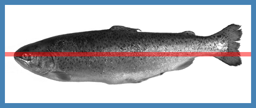
The widget_horizontal_cursor has a position that specifies its vertical location with respect to the parent widgets coordinate system. It has a pen which specifies its color, alpha and width or thickness. In addition it inherits all the properties and events from widget_interactive.
It has one interactive tracking spot - the line itself - which can be used to interactively track the cursor line.
The child coordinate system is positioned in a way that their origin is at the point. All children see the point’s location as being their origin (0, 0). You can additionally use a rendering transform to modify the child coordinate system.
widget_line
The widget_line is used to visualize a line.
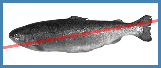
The widget_line has a position that specifies its location with respect to the parent widgets coordinate system. It has a pen which specifies its color, alpha and width or thickness. In addition it inherits all the properties and events from widget_interactive.
It has one interactive tracking spot - the line itself - which can be used to interactively track the line.
The child coordinate system is positioned in a way that their origin is at the line’s origin. All children see the line’s origin location as being their origin (0, 0). The positive x-axis extends in the direction of the line. You can additionally use a rendering transform to modify the child coordinate system.
widget_line_segment
The widget_line_segment is used to visualize a line segment.
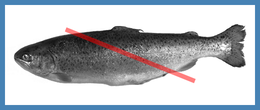
The widget_line_segment has a position that specifies its location with respect to the parent widgets coordinate system. It has a pen which specifies its color, alpha and width or thickness. In addition it inherits all the properties and events from widget_interactive.
It has three interactive tracking spots, which can be used to interactively track the line segment. The two endpoints can be used to track the endpoints, the line between can be used to track the entire line segment.
The child coordinate system is positioned in a way that their origin is at the line segment’s origin. All children see the line segment’s origin location as being their origin (0, 0). The positive x-axis extends in the direction of the line segment. You can additionally use a rendering transform to modify the child coordinate system.
widget_orthogonal_cursor
The widget_orthogonal_cursor is used to visualize a crossline cursor.
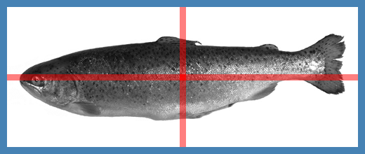
The widget_orthogonal_cursor has a position that specifies its location with respect to the parent widgets coordinate system. It has a pen which specifies its color, alpha and width or thickness. In addition it inherits all the properties and events from widget_interactive.
It has three interactive tracking spots - the horizontal line, the vertical line and the intersection point - which can be used to interactively track the cursor.
The child coordinate system is positioned in a way that their origin is at the point. All children see the point’s location as being their origin (0, 0). You can additionally use a rendering transform to modify the child coordinate system.
widget_orthogonal_grid
The widget_orthogonal_grid is used to visualize a grid with orthogonal grid lines.
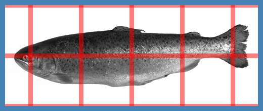
The widget_orthogonal_grid has a position that specifies its location with respect to the parent widgets coordinate system. It has a pen which specifies its color, alpha and width or thickness. It has a spacing vector which specifies the gridline spacing in the horizontal and vertical direction. In addition it inherits all the properties and events from widget_interactive.
The child coordinate system is positioned in a way that their origin is at the point. All children see the point’s location as being their origin (0, 0). You can additionally use a rendering transform to modify the child coordinate system.
widget_point
The widget_point is used to visualize a point.

The widget_point has a position that specifies its location with respect to the parent widgets coordinate system. It has a pen which specifies its color, alpha and width or thickness. In addition it inherits all the properties and events from widget_interactive.
It has one interactive tracking spot - the point itself - which can be used to interactively track the point.
The child coordinate system is positioned in a way that their origin is at the point. All children see the point’s location as being their origin (0, 0). You can additionally use a rendering transform to modify the child coordinate system.
widget_polar_grid
The widget_polar_grid is used to visualize a grid with circles/ellipses and sectors.

The widget_polar_grid has a position that specifies its location with respect to the parent widgets coordinate system. It has a pen which specifies its color, alpha and width or thickness. It has a spacing vector which specifies the ellipse radii. In addition it inherits all the properties and events from widget_interactive.
The child coordinate system is positioned in a way that their origin is at the point. All children see the point’s location as being their origin (0, 0). You can additionally use a rendering transform to modify the child coordinate system.
widget_polygon
The widget_polygon is used to visualize a polygon.

The widget_polygon has a position that specifies its location with respect to the parent widgets coordinate system. It has an outline pen which specifies color, alpha and width or thickness of the outline. It has a fill brush which specifies color and alpha of the inner region. In addition it inherits all the properties and events from widget_interactive.
It has n + 1 interactive tracking spots - the n vertices plus the polygon itself - which can be used to interactively track the vertices and the whole polygon.
The child coordinate system is taken unmodified from the parent. You can additionally use a rendering transform to modify the child coordinate system.
widget_quadrilateral
The widget_quadrilateral is used to visualize a quadrilateral.
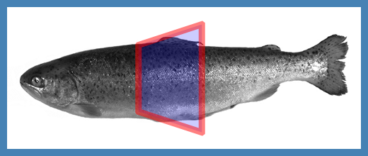
The widget_quadrilateral has a position that specifies its location with respect to the parent widgets coordinate system. It has an outline pen which specifies color, alpha and width or thickness of the outline. It has a fill brush which specifies color and alpha of the inner region. In addition it inherits all the properties and events from widget_interactive.
It has 5 interactive tracking spots - the 4 vertices plus the quadrilateral itself - which can be used to interactively track the vertices and the whole quadrilateral.
The child coordinate system is taken unmodified from the parent. You can additionally use a rendering transform to modify the child coordinate system.
widget_ray
The widget_ray is used to visualize a ray.
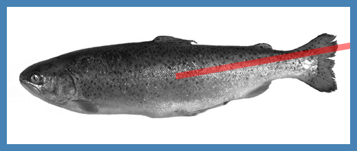
The widget_ray has a position that specifies its location with respect to the parent widgets coordinate system. It has a pen which specifies its color, alpha and width or thickness. In addition it inherits all the properties and events from widget_interactive.
It has one interactive tracking spot - the ray itself - which can be used to interactively track the ray.
The child coordinate system is positioned in a way that their origin is at the ray’s origin. All children see the ray’s origin location as being their origin (0, 0). The positive x-axis extends in the direction of the ray. You can additionally use a rendering transform to modify the child coordinate system.
widget_rule
The widget_rule is used to visualize a rule for measurement.

The widget_rule has a position that specifies its location with respect to the parent widgets coordinate system. It has a pen which specifies its color, alpha and width or thickness. In addition it inherits all the properties and events from widget_interactive.
It has three interactive tracking spots, which can be used to interactively track the rule. The two endpoints can be used to track the endpoints, the line between can be used to track the entire rule.
The child coordinate system is taken from the parent. You can additionally use a rendering transform to modify the child coordinate system.
widget_triangle
The widget_triangle is used to visualize a triangle.

The widget_triangle has a position that specifies its location with respect to the parent widgets coordinate system. It has an outline pen which specifies color, alpha and width or thickness of the outline. It has a fill brush which specifies color and alpha of the inner region. In addition it inherits all the properties and events from widget_interactive.
It has 4 interactive tracking spots - the 3 vertices plus the triangle itself - which can be used to interactively track the vertices and the whole triangle.
The child coordinate system is taken unmodified from the parent. You can additionally use a rendering transform to modify the child coordinate system.
widget_vertical_cursor
The widget_vertical_cursor is used to visualize a vertical cursor line.
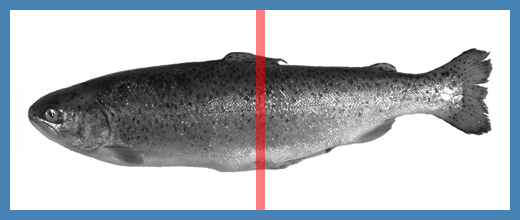
The widget_vertical_cursor has a position that specifies its horizontal location with respect to the parent widgets coordinate system. It has a pen which specifies its color, alpha and width or thickness. In addition it inherits all the properties and events from widget_interactive.
It has one interactive tracking spot - the line itself - which can be used to interactively track the cursor line.
The child coordinate system is positioned in a way that their origin is at the point. All children see the point’s location as being their origin (0, 0). You can additionally use a rendering transform to modify the child coordinate system.
Concrete Layoutable Widgets
Layoutable widgets know about their size and can be arranged in user defined layouts.
| widget | purpose |
|---|---|
| display, display_base | The display provides the connection to a window and establishes a home for other widgets. It implements zooming and scrolling. If a child widget does not take up all of the available space, the display may provide alignment or centering for the child widget. |
| widget_text | Displays text. |
| widget_layer | Groups other widgets. |
| widget_scale | Displays a scale. |
| widget_border | The border widget puts a border around its content. |
| widget_box | The box widget provides drawing of an axis-parallel rectangle. The user can drag around the box by picking it inside with the mouse and moving. He can also resize the box by picking the box lines or corners and dragging them. |
| widget_circle | Displays a circle. |
| widget_ellipse | Displays an ellipse. |
| widget_image | The image widget provides drawing of an image. This is one of the more obvious needs in image processing. |
| widget_palette | The palette widget provides horizontal or vertical drawing of a palette in graphical form (i.e. as grey shades or colors). |
| widget_polyline | Displays a view as a curve. |
display
The display is the connection between the host window system and nGI. In order to provide graphics and interaction, it is - besides being a window - also a widget. As such, it has the ability to position other child widgets.

The drawing shows how the display implements the widget box model.
The background color is used to clear the window background. There is nothing that can shine through, therefore the background is specified using a color without alpha information. The color is fully opaque. The background color will be visible in the margin area. The background_brush is then used to paint on top. This brush can be transparent - the degree of opacity is set with the brush’s alpha value - and the window background might shine through.
The child coordinate system is positioned in a way that their origin is at the top left corner. All children see this location as being their origin (0, 0). You can additionally use a rendering transform to modify the child coordinate system.
widget_box
The widget_box is used to visualize an axis parallel box.

The drawing shows how the widget_box implements the widget box model.
The background_brush is used to fill anything inside the margin edge. The outline pen is used to draw the box outline and the fill brush is used to fill the box interior. The child coordinate system is shown in red. This coordinate system is relevant to specify the coordinates of child widgets. The area outlined by the padding edge is used as the clipping region, if the clip property is set. The child coordinate system moves, scales and rotates, if a widget_transform is set for the respective children.
Here is an illustration derived from the widget_box sample.
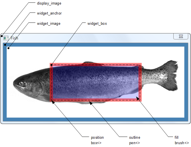
The graphic illustrates how the various widgets are grouped visually in this sample. There is also an implied hierarchy, which is shown in the following illustration.

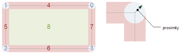
The behavior of the widget_box is affected by the widget properties. If the widget_box is active and visible, it can be dragged aground interactively. The widget_box has nine hit spots which are active for dragging: the four corners (north-east, north-west, south-west and south-east), the four sides (north, west, south, and east) and the interior. If a corner is grabbed and dragged with the mouse, the two sides adjacent to this corner are moved. If a side is grabbed and dragged with the mouse, the two corners adjacent to this side are moved. If the interior is grabbed and dragged with the mouse, the whole widget_box is moved, but its size does not change. The following graphic shows the hit spot numbering as well as the effect of the proximity property.
widget_circle
The widget_circle is used to visualize a circle. Here is an illustration derived from the widget_circle sample.

The graphic illustrates how the various widgets are grouped visually in this sample.
There is also an implied hierarchy, which is shown in the following illustration.

widget_image.
Graphical hierarchy of widget_circle on top of a widget_image.
The visual parameters of the widget_circle can be adjusted programmatically with the position, outline and fill properties. The position is a circle that specifies the center as well as the radius of the widget_circle with respect to the parent coordinate system. The outline is a pen that specifies color, alpha and width of the widget_circle outline. The fill is a brush that specifies color and alpha of the widget_circle interior.
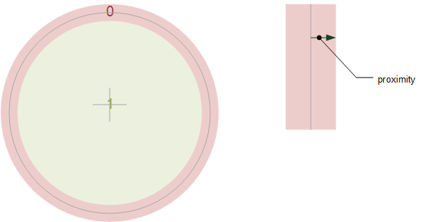
The behavior of the widget_circle is affected by the widget properties. If the widget_circle is active and visible, it can be dragged aground interactively. The widget_circle has two hit spots which are active for dragging: the circular outline and the interior. If the outline is grabbed and dragged with the mouse, the radius is changed. If the interior is grabbed and dragged with the mouse, the whole widget_circle is moved, but its size does not change. The following graphic shows the hit spot numbering as well as the effect of the proximity property.
The content size of the widget_circle is determined by the bounding box around the position circle.
widget_horizontal_scale
The widget_horizontal_scale is used to visualize a horizontal scale.
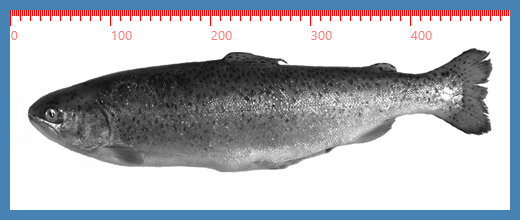
The widget_horizontal_scale has a position that specifies its vertical location with respect to the parent widgets coordinate system. It has a pen which specifies its color, alpha and width or thickness. In addition it inherits all the properties and events from widget_interactive.
The child coordinate system is positioned in a way that their origin is at the point. All children see the point’s location as being their origin (0, 0). You can additionally use a rendering transform to modify the child coordinate system.
widget_image
The widget_image is used to visualize an image.

The drawing shows how the widget_image implements the widget box model.
The background_brush is used to fill anything inside the margin edge. The view is used to provide the image data to the widget.
The child coordinate system is positioned in a way that their origin is at the top left corner, moved by half a pixel right and half a pixel down. This is done to make sure that integer coordinates are in the middle of a pixel. All children see this location as being their origin (0, 0). You can additionally use a rendering transform to modify the child coordinate system.
widget_layer
The widget_layer is used to group other widgets.

The drawing shows how the widget_layer implements the widget box model.
The background_brush is used to fill anything inside the margin edge.
The child coordinate system is positioned in a way that their origin is at the top left corner. All children see this location as being their origin (0, 0). You can additionally use a rendering transform to modify the child coordinate system.
widget_palette
The widget_palette is used to visualize a palette.

The drawing shows how the widget_palette implements the widget box model.
The background_brush is used to fill anything inside the margin edge. The view is used to provide the palette data to the widget.
The child coordinate system is positioned in a way that their origin is at the top left corner, moved by half a pixel right. This is done to make sure that integer coordinates are in the middle of a pixel. All children see this location as being their origin (0, 0). You can additionally use a rendering transform to modify the child coordinate system.
widget_vertical_scale
The widget_vertical_scale is used to visualize a vertical scale.
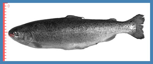
The widget_vertical_scale has a position that specifies its horizontal location with respect to the parent widgets coordinate system. It has a pen which specifies its color, alpha and width or thickness. In addition it inherits all the properties and events from widget_interactive.
The child coordinate system is positioned in a way that their origin is at the point. All children see the point’s location as being their origin (0, 0). You can additionally use a rendering transform to modify the child coordinate system.